Power BI Heatmaps: A Comprehensive Guide
Maximize the full potential of your data with Power BI heatmaps. These dynamic visuals help you uncover patterns, trends, and relationships using color gradients to highlight value intensity. Ideal for sales analysis, customer segmentation, and website optimization, heatmaps provide actionable insights for data-driven decisions. Begin by organizing your data in Excel or CSV, then import it into Power BI. Personalize your heatmap with color coding and geographic mapping. Enhance it further with slicers, filters, and tooltips for added context. Optimize performance by trimming unnecessary calculations and fields. Delve into the content, and you’ll explore more advanced analytics and optimization techniques.
What is a Power BI Heatmap?
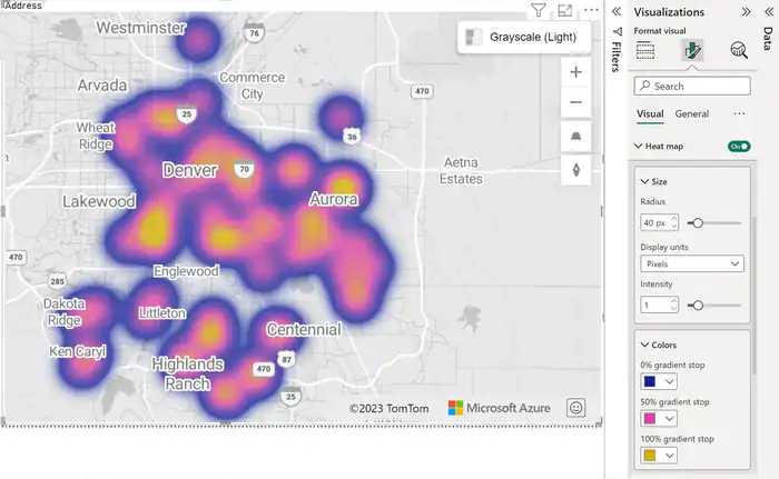
A Power BI heatmap is a dynamic and visually engaging data visualization technique that uses colors and intensity to reveal patterns, trends, and relationships within a dataset. This heatmap visualization consists of a grid or matrix where each cell represents a data point. The colors in these cells correspond to the underlying data values, employing color gradients to indicate value intensity—cooler colors for lower values and warmer colors for higher values.
By leveraging this visual representation, you can quickly identify areas of interest within your dataset. This makes Power BI heatmaps particularly useful for data analysis, as they make it easy to spot correlations and anomalies without sifting through endless rows of data.
The versatility of heatmaps allows you to handle various data types, including numerical, categorical, and geographical data.
Additionally, Power BI heatmaps offer interactivity and customization options that enhance your analytical capabilities. You can incorporate labels, tooltips, and drill-through actions to gain more detailed insights into specific data points. This feature-rich environment guarantees that your heatmap isn’t just a static image but a powerful tool for in-depth data exploration. For those interested in mastering these features, Power BI training in Dubai can provide the necessary skills and knowledge to effectively utilize this dynamic tool.
With these capabilities at your disposal, you can make more informed decisions based on a clear and concise visual representation of your data.
Uses of a Power BI Heatmap
Harnessing a Power BI heatmap, you can reveal actionable insights across various domains, making it an invaluable tool for data-driven decision-making. In sales analysis, a heatmap helps you identify regions with high or low sales performance, visualize trends, and uncover growth opportunities. This information aids in resource allocation, marketing strategies, and sales targeting.
For customer segmentation, Power BI heatmaps let you group customers based on demographics, purchasing behavior, or engagement metrics. This segmentation facilitates targeted marketing campaigns and personalized customer experiences, enhancing overall customer satisfaction.
In website optimization, heatmaps are essential for visualizing user interactions, click-through rates, and session durations. By understanding these metrics, you can optimize your website for improved user experiences and higher conversion rates.
When it comes to risk assessment, heatmaps allow you to map data related to risk factors, regulatory compliance, and security incidents. Identifying high-risk areas enables you to implement effective mitigation strategies, ensuring regulatory compliance and minimizing potential threats.
Lastly, in logistics efficiency, heatmaps help you visualize transportation routes, inventory levels, and production cycles. This visualization aids in identifying bottlenecks and streamlining supply chain processes, leading to enhanced operational efficiency.
Creating a Heatmap in Power BI
To create a heatmap in Power BI, start by ensuring your data is in a compatible format and properly organized. You’ll want to clean up your data, making sure it’s structured in Excel, CSV, or a database, and identify the relevant fields for your heatmap.
Next, launch Power BI Desktop and select ‘Get Data’ to import your prepared data. Connect to your data file or database and follow the prompts to load it into Power BI. Once your data is loaded, create a new report by clicking on ‘Report’ to set up your canvas.
Now, locate the ‘Visualization‘ pane and select the Heatmap type. Drag and drop the necessary dimensions, such as geographic regions, into the appropriate fields. Place the values you want to represent, like sales figures, into the ‘Values’ field. This step is essential for your data analysis and visual representation.
To make your heatmap meaningful, adjust the color coding by customizing the color scale and gradients. This will enhance your data visualization. Make sure you map any required geographic mapping fields accurately.
Enhancing a Power BI Heatmap
Enhance your Power BI heatmap by experimenting with different color scales and gradients to make your data more visually appealing and easier to interpret. Begin with color customization to highlight significant patterns. Adjust scales and gradients to emphasize variations, making complex data simpler to understand.
Next, focus on tooltips enhancement. Customize tooltips to provide additional context and information, helping users grasp intricate data points effortlessly. This step adds layers of clarity without cluttering the visual.
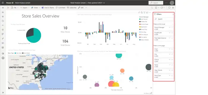
Boost your heatmap’s interactivity options by incorporating slicers, filters, and cross-highlighting. These features allow users to explore data dynamically, uncovering deeper insights. Implementing drill-through actions and hierarchies further enhances detailed data exploration, enabling users to navigate from high-level summaries to granular details seamlessly.
Integrate advanced analytics to add depth to your visualizations. Leverage trend lines, reference lines, and forecast lines to predict future patterns. Utilizing clustering algorithms and statistical models can unearth hidden relationships within your data.
Lastly, apply performance optimization tips. Streamline your heatmap by reducing unnecessary calculations and removing redundant fields. This guarantees efficient processing and a smoother user experience, making your heatmap not only powerful but also responsive.


